

In 1966, Wes Wilson was designing posters for Bill Graham's concerts at the Fillmore Auditorium in San Francisco, and the story goes that Graham looked at one and said, "I can't read it." About 25 years later, in Bergen, Norway, a band called Immortal asked an artist in their scene for a logo and made that the brief.
Wilson's reply, as the Denver Art Museum tells it, was that this was why people would stop and look. Immortal's version was blunter. The artist, Jannicke Wiese-Hansen, told Rise Metal in 2022 that the band wanted lettering that wasn't readable. Fans would recognise the mark as a whole. Anyone who couldn't would find the name printed on the side of the album.
Sometimes, then, it's on purpose. But keeping outsiders out was only one of the routes that took metal lettering from Judas Priest's clean angles to today's near-abstract tangles, and the genre's most prolific logo designer argues for logos people can read.
In Bergen, It Was the Brief
Wiese-Hansen was part of the Bergen scene around 1990 and didn't play an instrument. She had never drawn a logo before Immortal asked. The band wanted an inverted cross worked in, and they looked at two existing logos as models: Mayhem's and Unleashed's.
An earlier interview with Queens of Steel gives the same account and puts the idea in five words: the logo "should not easily be read." The page is stamped April 2005, but the text refers to events after 2012 and the earliest archived copy is from January 2021, so we treat it as undated. Both interviews are her memory of something that happened decades before.
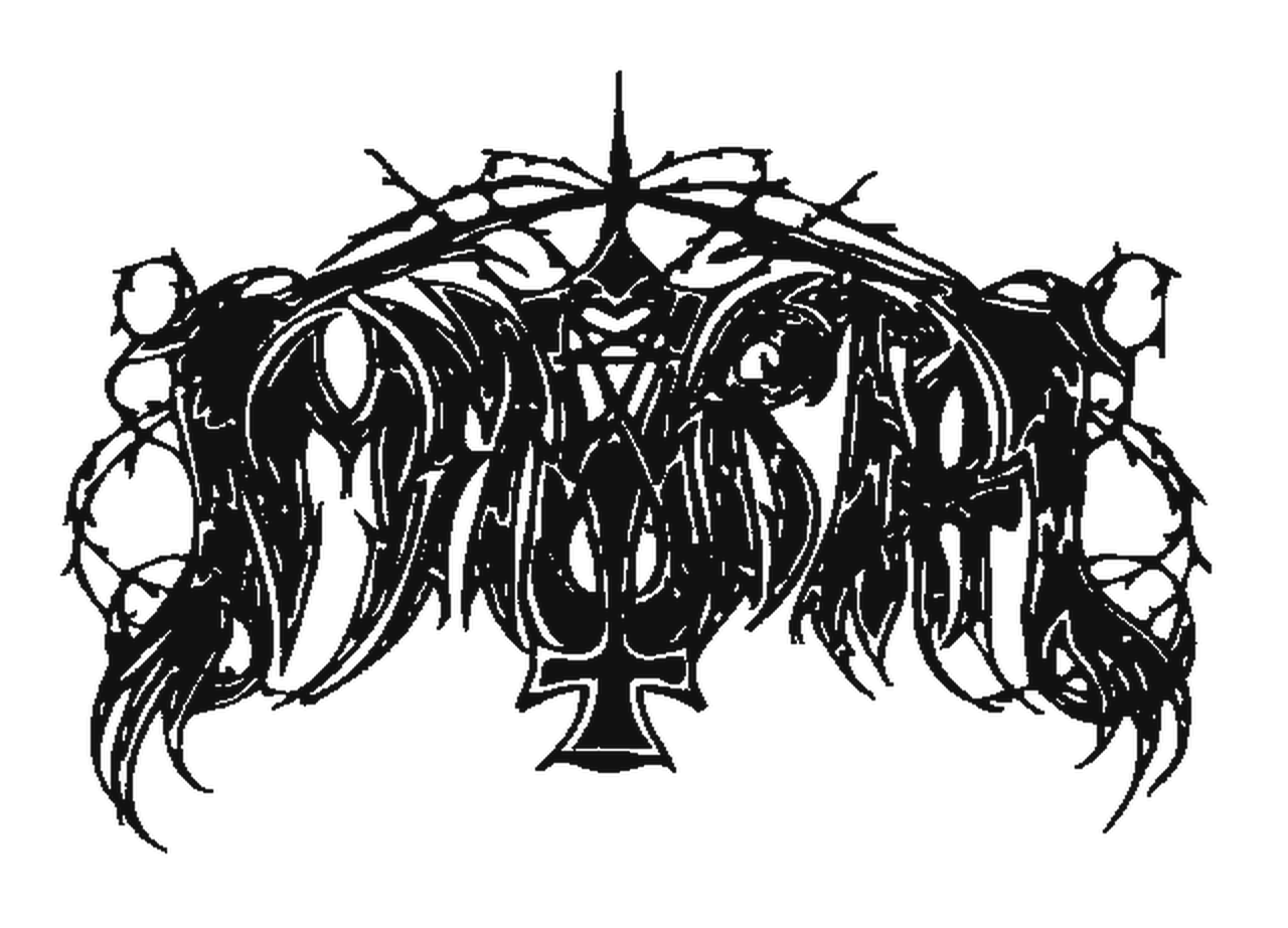
 Immortal's logo as it appeared on the band's first album, drawn by Jannicke Wiese-Hansen. Used with permission.
By her own account the idea didn't last. As those bands got bigger, she said, they moved to more readable logos.
The job changed her working life. The only tattooer in town asked her to draw for his shop and took her on as an apprentice. In 2022 she said she'd been tattooing for 27 years.
San Francisco Had the Same Rule
Victor Moscoso made posters in the same scene as Wilson. He told The Paris Review in March 2015 that he reversed his training by making lettering as unreadable as he could. The posters implied a question, "Are you hip?", though he says nobody said it aloud. The artists also competed with each other, and he has recounted Rick Griffin proposing psychedelic lettering that said nothing at all.
Moscoso's posters were running the Bergen brief a generation before Bergen. No metal designer we found cites them, though. What the two scenes do share is an ancestor: Wilson's lettering derived from Vienna Secession lettering, according to the Smithsonian American Art Museum, and specifically from the work of Alfred Roller, according to AIGA Eye on Design. Roller's poster for the 16th Secession exhibition is signed 1902, per the V&A. The metal logo designer Christophe Szpajdel names Art Nouveau as an influence on his own work. Dayal Patterson drew the same parallel in a Kerrang feature in April 2018.
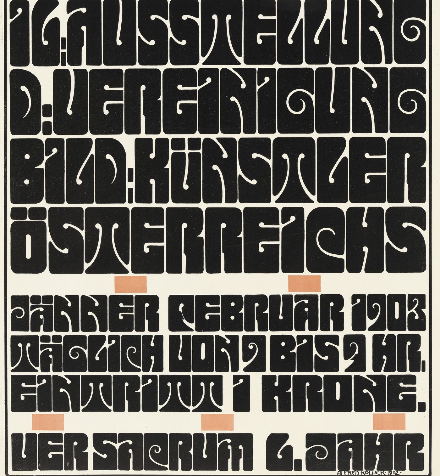
 Detail of Alfred Roller's poster for the 16th Secession exhibition, signed 1902. Wien Museum, CC0.
Poster House calls the Graham story popular myth and gives Wilson's reply in different words. The effect it describes was real enough to make the news: a Time magazine article headlined "Nouveau Frisco" reported that Wilson's Fillmore posters were unreadable at first glance, so people stopped for a second look.
The Numbers
On the one bill we counted, unreadable logos were the minority. On the poster for Wretched Rites MMXXVI, an underground festival at Harlow's in Sacramento on 14 and 15 November 2026 (Etix listing), a single reader coded the 20 band logos as 8 readable, 8 partly readable and 4 unreadable.
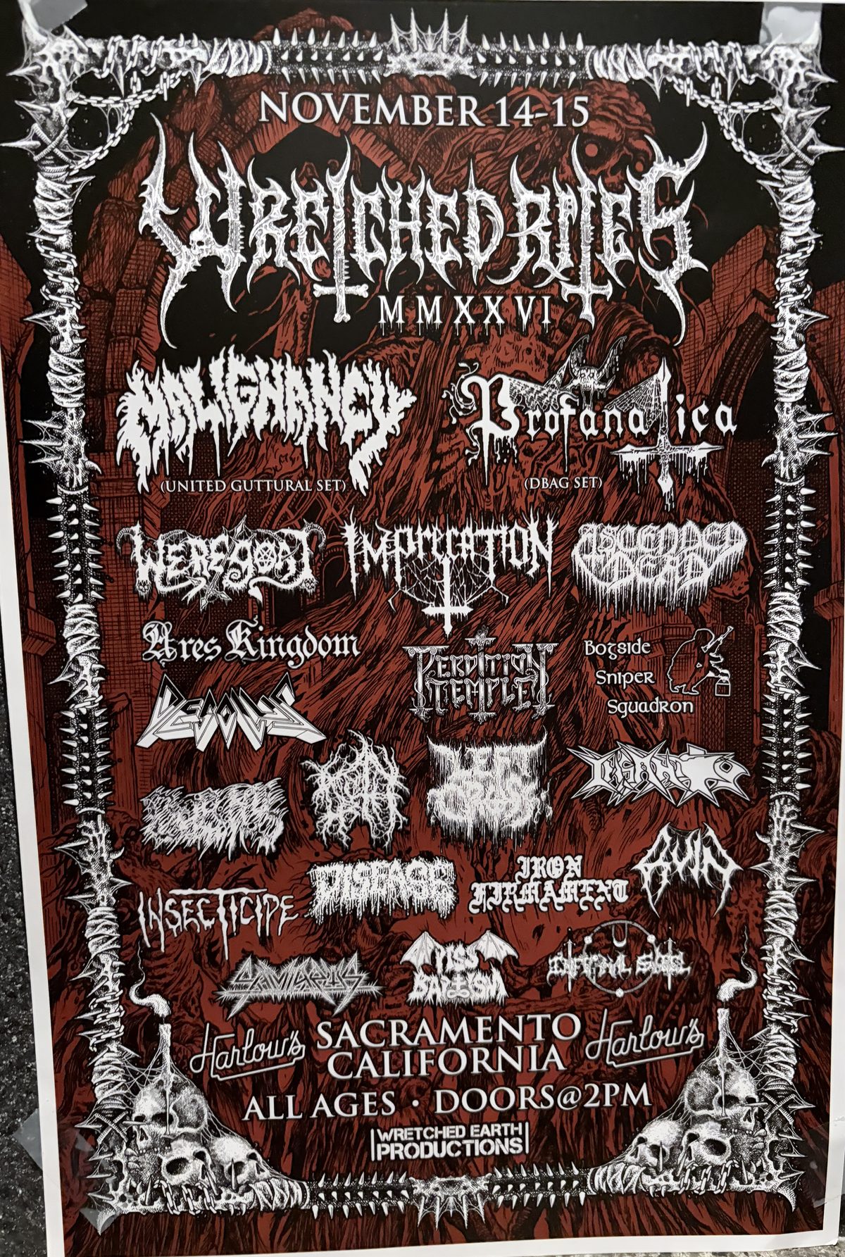
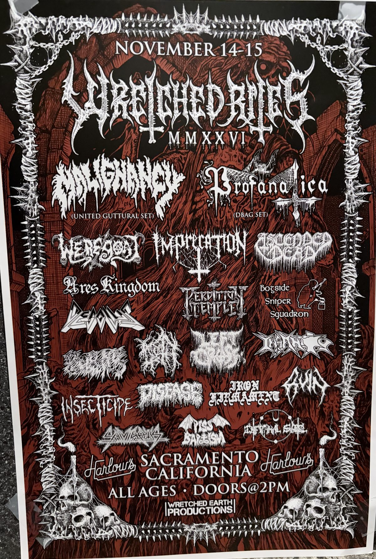 The Wretched Rites MMXXVI poster, Sacramento, November 2026. Photo: Concerts Remembered.
A 2026 study in Transverso coded 20 metal logos made between 1985 and 2021 and found sharp edges in 19, root-like forms in 14 and elongated extremities in 11.
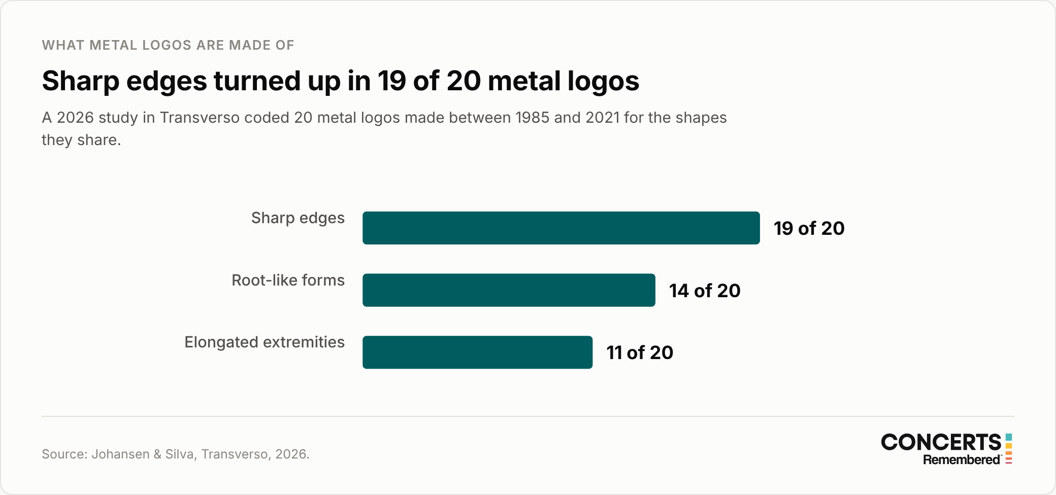
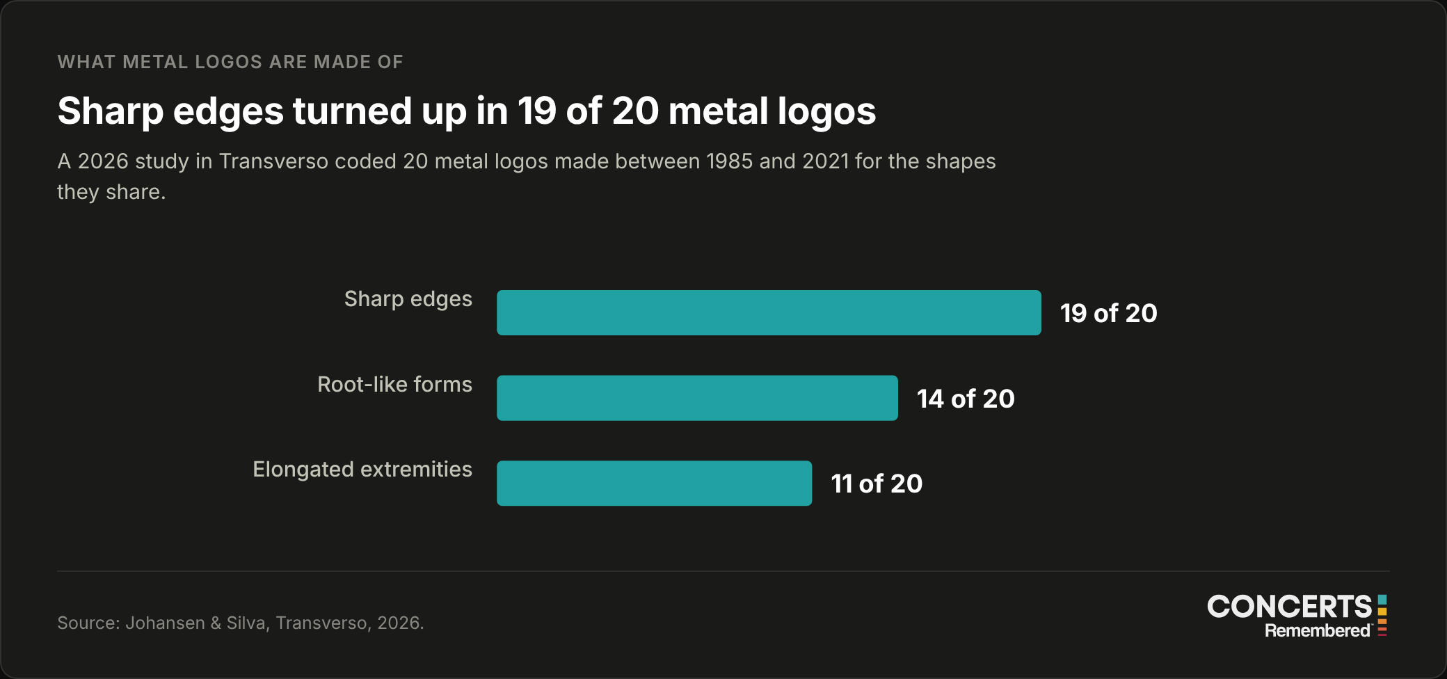 From a 2026 study of 20 logos made between 1985 and 2021.
Szpajdel rates logos for legibility from one to ten and told Kerrang in that 2018 feature that most clients want "somewhere between six and 10."
From Clean Angles to Tangled Roots
Each heavier subgenre settled on its own lettering as it appeared, and the path from readable to unreadable wasn't straight. Much of it was borrowed, from older bands or from flyers and fanzines that arrived by post, and plenty of logos were simply whatever a band member could draw.
The 1970s: built to be read
A designer quoted by Wired in October 2015 described Black Sabbath's earliest typography as starting out psychedelic before metal lettering turned sharper. VICE calls the band's 1973 Sabbath Bloody Sabbath logo an early, trend-setting use of blackletter, the heavy medieval script that keeps coming back in this story.
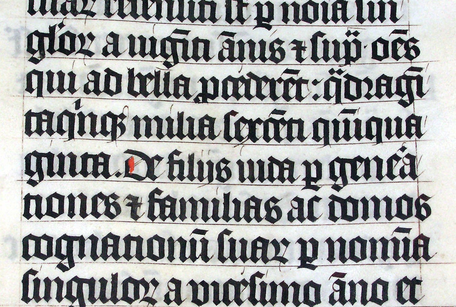
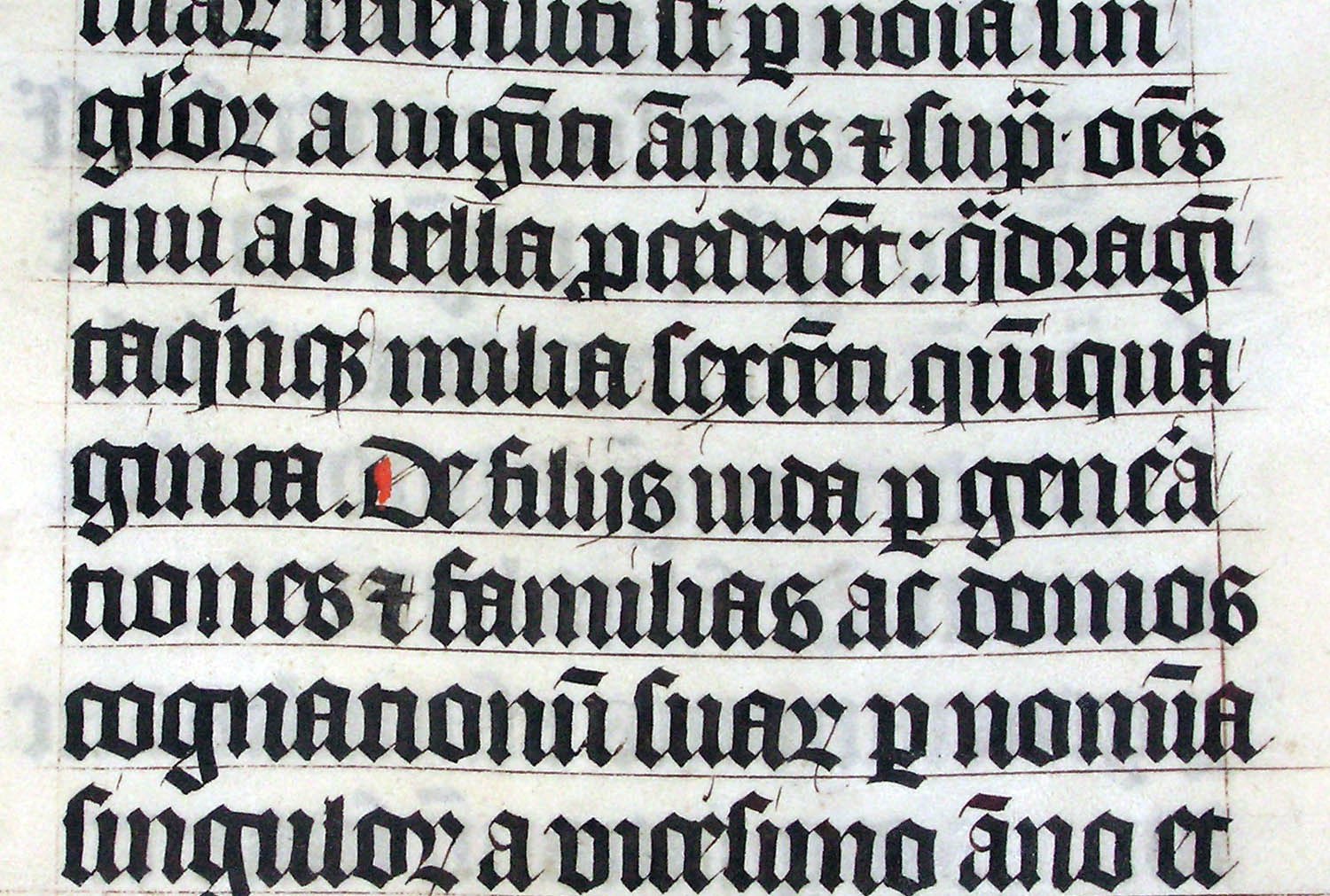 Blackletter in the Malmesbury Bible, written in 1407. Photo: Adrian Pingstone, public domain.
The Judas Priest logo arrived in 1978, drawn by a record-company art director. It's the mark Szpajdel, in a 2023 interview with Blaze Type, uses as his example of traditional heavy metal lettering: simple and dynamic. Around the same time Steve Harris drew an early Iron Maiden logo in an Olde English style. "It was boring really," he told The Quietus in 2012.
The early 1980s: the bands draw their own
Tom G. Warrior said Hellhammer and Celtic Frost made their own logos, flyers and covers because nobody would help them, and called it "a situation of necessity." Mayhem's Necrobutcher puts it in four words: "I drew the logo." His book adds that the band painted it at Langhus station, "likely inspired by the movie The Warriors" and its gang tags.
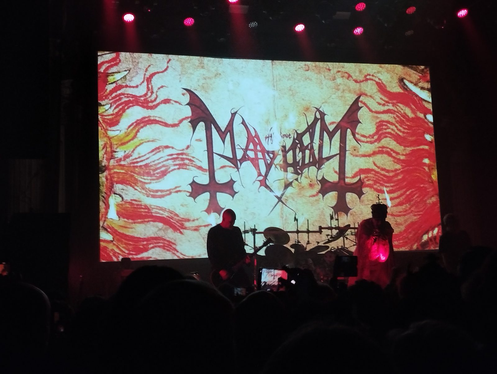
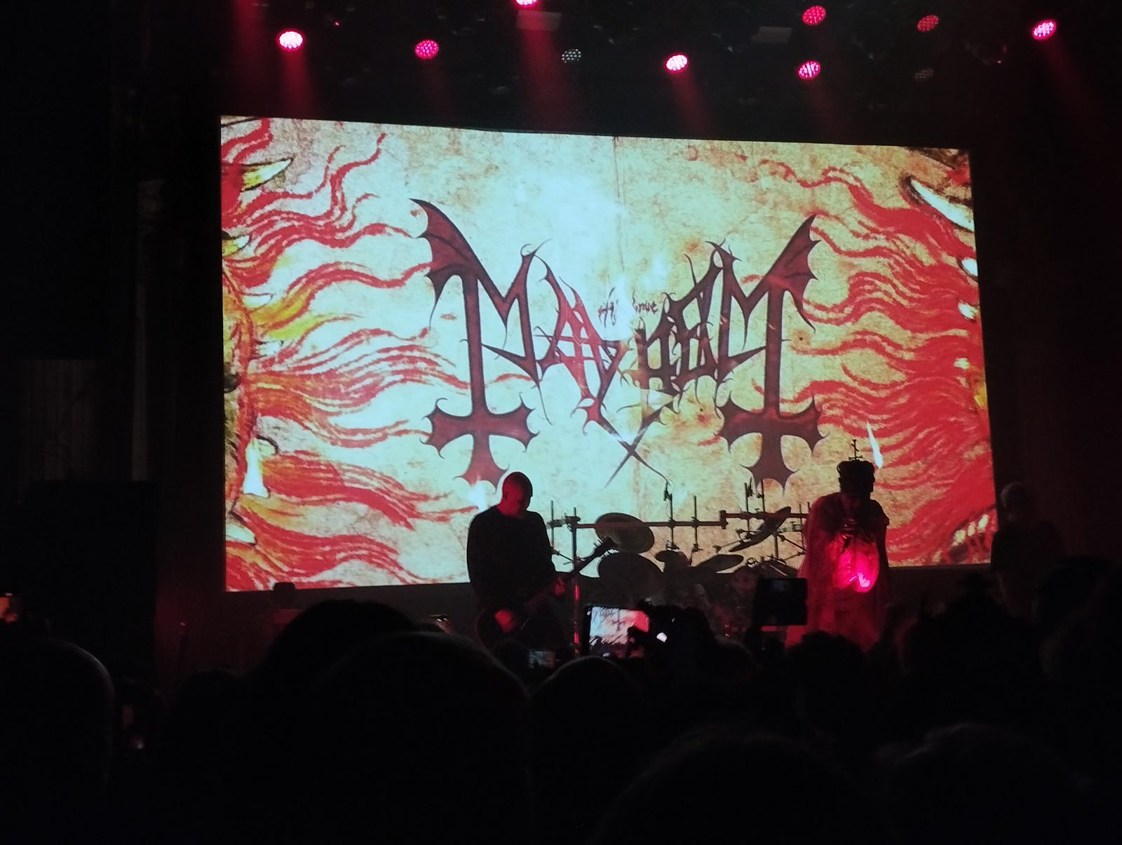 Mayhem's logo on screen at the Élysée-Montmartre, Paris, 11 February 2026. Photo: ManoSolo13241324, CC0.
Hand-drawn letters started growing tails, hooks and symbols, the sharp, aggressive curves Szpajdel now files under death metal. Jeff Becerra said Keri Lindstrom drew the original Possessed logo and that Vince Stevenson was later asked to make the lettering more gothic and Germanic. Chuck Schuldiner said the Death logo was created in 1983, when the members were 16, with an inverted cross he later removed because "I'm not religious at all."
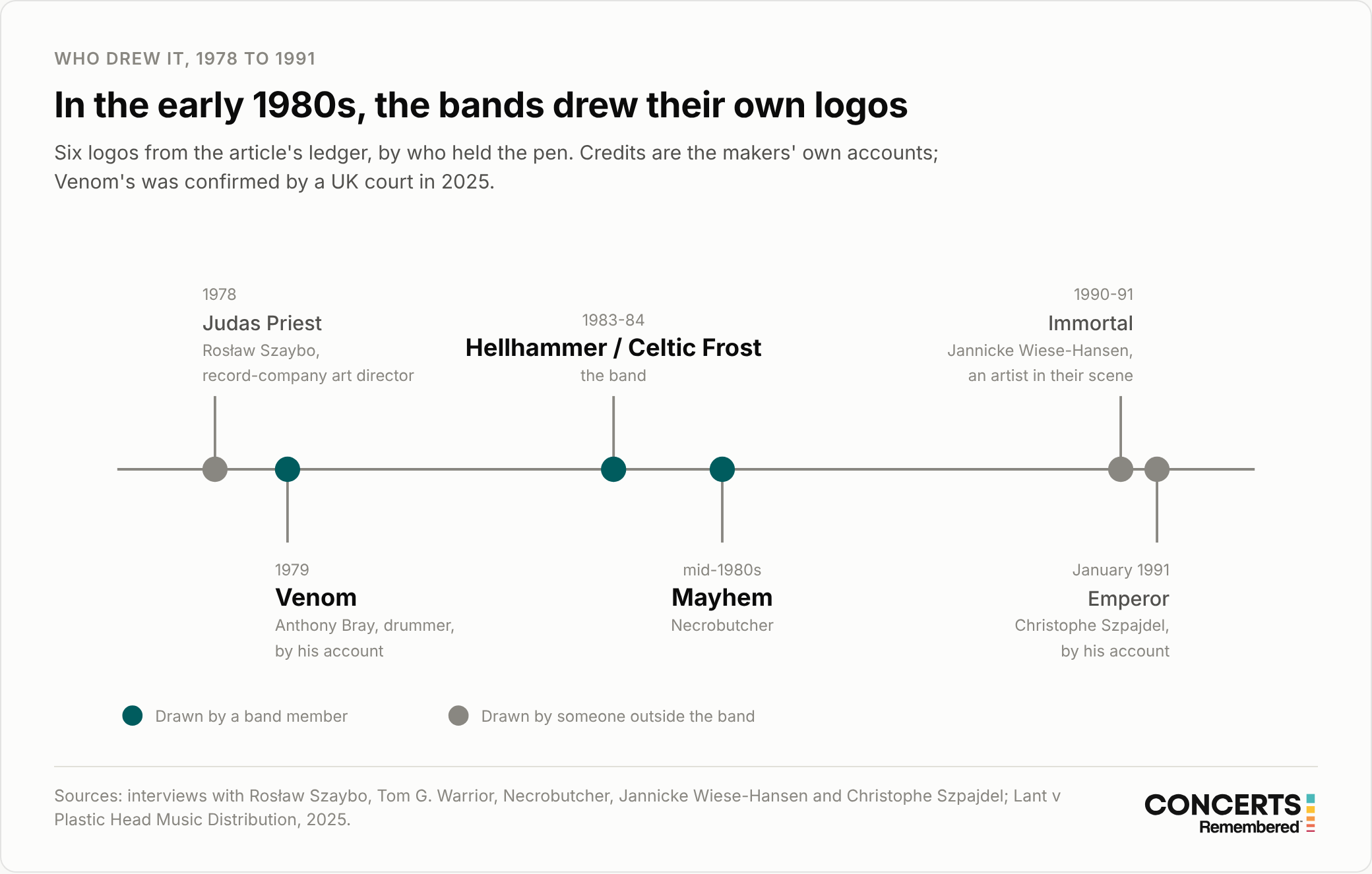
 Credits are the makers' own accounts. Venom's was confirmed by a UK court in 2025.
Bands also borrowed from each other, or were accused of it. Kam Lee, who was in Mantas, the band that became Death, said in June 2022 that the devil's-tail "M" in the Mantas logo was "completely stolen" from Possessed. A former bandmate, Rick Rozz, publicly rebutted Lee's claims, and Lee later said his harshest wording about the borrowing had been a bad choice, and that he meant heavy influence.
1989 to 1991: no agreement on what a logo was for
Immortal asked for a logo outsiders couldn't read. Darkthrone went the other way and simplified theirs, and Szpajdel, drawing for Emperor, aimed for something you could take in at a glance. Varg Vikernes of Burzum, who was convicted in 1994 of murder and church arsons and is known for extremist views, wrote in 2009 that a female friend drew him a logo in 1991, that he rejected it as following a trend, and that he used Gothic sticker letters instead.
The black metal convention that settled, in Szpajdel's description, is pentagrams and gothic-inspired lettering.
Brutal death metal and slam: letters become shapes
The last step is the one people mean when they say they can't read metal logos. In the Blaze Type interview, Szpajdel describes brutal death metal logos as nearly illegible and thick with ligatures, the strokes that tie one letter to the next. His examples are Gurglectomy and Vaginal Dissection. Fans have their own names for the result, "slam blobs" and "branch logos" among them.
| Subgenre | What the lettering does | Szpajdel's examples |
|---|---|---|
| Traditional heavy metal | Simple, dynamic shapes | Judas Priest |
| Death metal | Sharp, aggressive curves | Possessed, Sepultura, Morbid Angel |
| Black metal | Pentagrams, gothic-inspired lettering | Watain, Dark Funeral, Marduk |
| Grindcore | Messy, loose, little structure | Napalm Death, Agathocles |
| Brutal death metal | Nearly illegible, heavy ligatures | Gurglectomy, Vaginal Dissection |
| Technical death metal | Straight, geometric letters | Archspire |
Why it went that far is less documented than how it looks. Mark Riddick, whose book Logos From Hell runs to 600 pages, said in the Kerrang feature that the more illegible the logo, the more extreme you can assume the band to be. VICE reported in October 2016 that Szpajdel's nearly unreadable designs for DEEPRED and N.V.One answered clients who wanted something "black metal as fuck." Cody Davidson of Sanguisugabogg told Metal Injection in 2023 that "the gimmick of the most illegible logo," paired with an unpronounceable name, had worked in the band's favour. And one interviewee in a 2020 Urbania feature says the escalation ran from Darkthrone into slam and goregrind, though that's one person's account.
None of the designers or bands quoted here dates the moment lettering turned into something closer to illustration, or says who pushed it there.
How a look travelled
Before the internet, all of this moved by post. In Belgium in 1989, Szpajdel was receiving flyers for a concert at Sala Lautaro in Santiago de Chile, and says the logos on them, from bands including Sarcófago, Sepultura, Death Yell and Torturer, shaped his taste. He co-published a fanzine, Septicore, that ran to seven issues between 1989 and 1992. Riddick described buying music in 1991 through handwritten letters, cut-and-paste fanzine reviews and printed fliers, and has said his black-and-white style is a homage to a scene where everything was reproduced on a photocopier or in one-colour offset.
A logo also worked as a label. The California band Fatalist took one in the style of Sweden's Nihilist so that people who saw it "would know what we sounded like," they told Teeth of the Divine. They meant to replace it with something original and never did.
Even the Designers Disagree
Szpajdel was born in Belgium, taught himself, and has drawn thousands of logos; he's known as the Lord of the Logos. His position on legibility hasn't changed. Beyond the one-to-ten scale, he describes unreadable logos as something bands make for themselves and a small circle of friends, and he names Bathory as his model of simplicity. He told RTBF in 2024, in French, that the flowing techniques of Art Nouveau are what keep his logos legible.
He also draws what clients ask for, which is how he came to make the nearly unreadable DEEPRED and N.V.One logos. Riddick treats illegibility as a measure of how extreme a band is. Wiese-Hansen, whose brief was to be unreadable, says bands moved toward more readable logos as they grew.
Four Logos and Who Drew Them
Venom: settled in court
In early 1979, by his own account, drummer Anthony Bray painted Venom's name onto a drum riser. Singer Conrad Lant, who joined in October or November of that year, said he designed the logo himself in late 1979 or early 1980. Reference sites credited Lant. On 31 July 2025, 46 years after the riser, a UK court ruled in Lant v Plastic Head Music Distribution that Bray was the author and owns the copyright. Two other witnesses supported him, according to NIPC Law's summary. The logo had been on record sleeves since Welcome to Hell in 1981.
The same judgment records Lant accepting that the band's Sigil of Baphomet adapted an 1897 design by Stanislas de Guaita.
Judas Priest: drawn by a man who didn't love metal
Rosław Szaybo was art director at CBS in London. He told Culture.pl in 2013 that he designed the Sin After Sin cover in 1977 and then a new logo for the band's next album, which they still use. That puts it on Stained Class in 1978, although a 2023 Polish profile on dzieje.pl dates it to 1980 and British Steel. The same profile credits him with The Clash's logotype. In a 2018 interview with grafmag.pl, Szaybo listed heavy metal among the kinds of music he didn't love.
Darkthrone: the simplified one
Darkthrone's logo is the usual example of unreadable black metal lettering. Fenriz, the band's drummer, told metal.de in 2013, in German, that the band had three logos before it, that it was made shortly before the first album, Soulside Journey, which he dated to 1990, and that it simplified an earlier logo that had been too complicated. He called it death metal lettering that never really suited black metal. In another interview that year he recalled an early logo with the words "death epic doom" written on it.
Nobody from the band has said who drew it. Stereogum and Decibel both credited Tomas Lindberg of At the Gates in 2013, without a statement from Lindberg.
Emperor: drawn during exams
Szpajdel told William Pinfold, in a January 2016 interview, that he drew Emperor's logo in January 1991, aged twenty, during his first-year winter exams, and that his name only became known when In the Nightside Eclipse came out in 1994. Other published dates run from 1989 to 1993, and 1989 is before the band existed. His stated aim was simplicity and immediate impact, and he names Darkthrone's logo as his example of a stereotype.
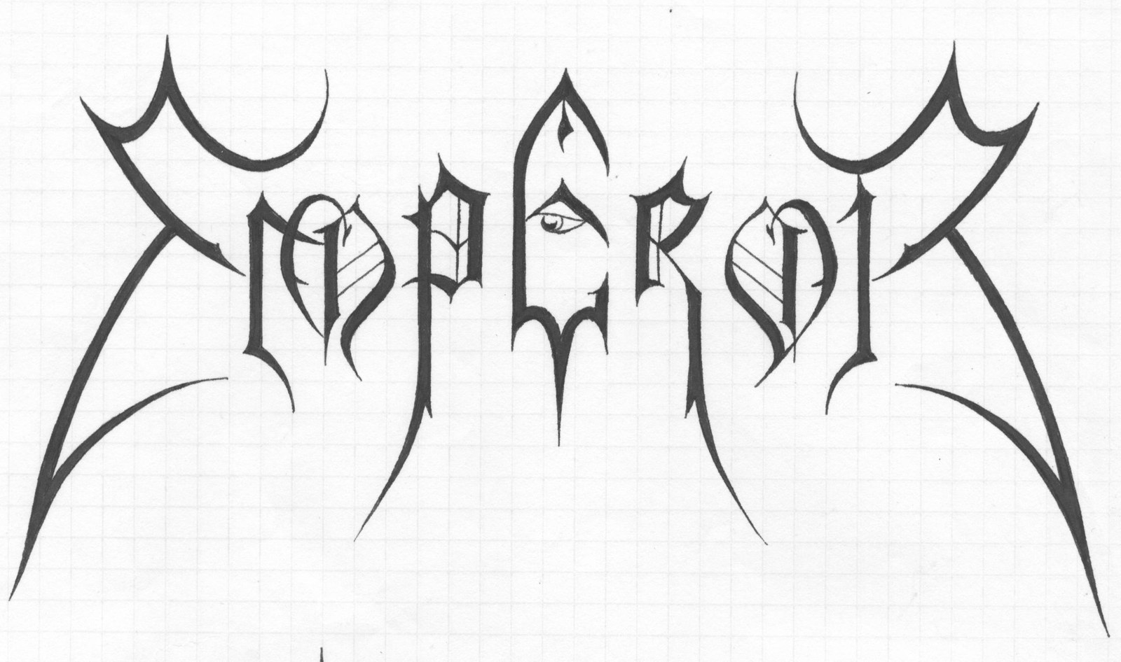
 The Emperor logo, drawn by Christophe Szpajdel. Courtesy of the artist.
Out of the Underground
Gestalten published Szpajdel's Lord of the Logos in January 2010, according to Szpajdel's own site, and the Walker Art Center commissioned him in 2012. Pop stars followed in 2016, when Szpajdel drew a logo for Rihanna's MTV Video Music Awards appearance and her Anti World Tour, and Riddick drew a stamp-style logo for Justin Bieber's Purpose tour merchandise. "I just did the Bieber logo stamp," Riddick told Bandcamp Daily; the tour's pentagram-style logo wasn't his.
The lettering on Kanye West's Pablo merchandise is often read as metal-derived as well, but its designer, Cali Thornhill DeWitt, traced it to Chicano and Los Angeles memorial shirts, Dazed reported in 2016. In 2025, Le Signe, the Centre National du Graphisme in Chaumont, staged an exhibition called "Metalogo" and noted that such logos now turn up on K-pop and rap covers.
The Complication
The account above is built from examples, not measurement. No study we found tracks legibility over time, and the only count in this article is our own, of one poster. The pull also runs the other way. Darkthrone simplified, Emperor's designer aimed for clarity, and Party Cannon's toy-shop logo went viral on the poster for Bay Area Deathfest 2 in 2015. The version that spread had been edited, though. On the original, MetalSucks noted, their logo was the same white-to-gold as every other band's, and Creative Bloq added a correction saying the poster had been tampered with.
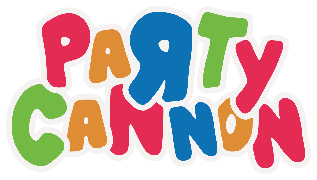
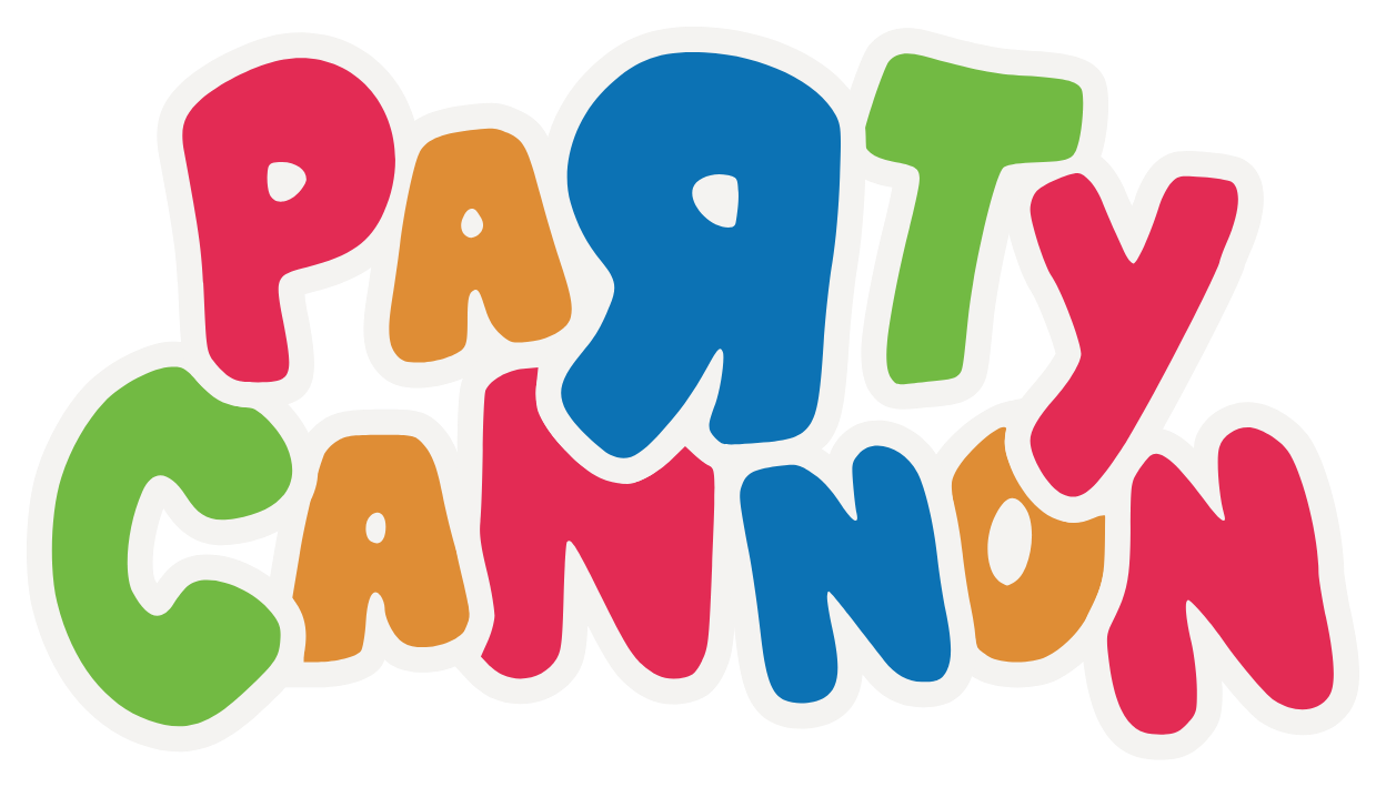 Party Cannon's logo, released by the band under CC0.
The Bergen account rests on memory. It's consistent across two interviews, and Vikernes's account independently confirms that Wiese-Hansen drew for that scene: she lists a demo logo for Burzum among her work. His own verdict on the subject was that "the font was and still is irrelevant." There's no document of the Immortal brief from the time.
Other makers describe something more casual. Fenriz said Darkthrone's logo never really suited black metal. Morbid Angel's Trey Azagthoth told Metal-Rules in September 2003 that he couldn't remember who drew theirs.
A 2021 paper presented at IEEE alt.VIS found that logo shapes cluster by genre, which shows the styles differ but not why a band chose one. No one we found claims to have originated thorny, branch-like, dripping or skeletal lettering. And no band or designer quoted here says they went unreadable to reject commercial branding.
Fans have been split for years. Forum threads from 2013 and 2024 carry both sides: the logo as calligraphy and genre art, and the objection that a name nobody can read defeats its purpose.
What This Means for Fans
You can often tell the subgenre from the shape before you can read the name. Clean, angular lettering usually means traditional metal or thrash, and curves with hooks point to death metal. Symmetry and gothic lettering point to black metal, and a dense, fibrous mass to brutal death metal or slam.
On a festival poster, the logos you can't read aren't a printing mistake, and on the one bill we counted they were 4 of 20.
If you can't read one, the name is printed plainly somewhere nearby. Check the spine, the ticket listing or the running order.
Reading it was never the only way in, either. The abstract of a 2024 study of Peruvian fans in Metal Music Studies reports that a logo's silhouette builds a connection with fans even when it can't be read.
Reference: Who Drew What
We traced 18 well-known logos through interviews with the people who drew them or the bands that used them, plus the Venom judgment. They were chosen for prominence, so this is a ledger and not a sample.
| Status | What it means | Logos |
|---|---|---|
| Confirmed | The designer or a court says so | 5 |
| Band account | A band member names the drawer | 4 |
| Disputed | Credible sources conflict | 2 |
| Press only | Magazines assert it; no first-person source found | 3 |
| Unknown | No credit found | 4 |
| Logo | First used | Credited to | Status | Basis |
|---|---|---|---|---|
| Judas Priest | 1978 | Rosław Szaybo | Confirmed | His own account |
| Motörhead | 1977 | Lettering: Phil Smee. Snaggletooth: Joe Petagno | Press only (lettering) | Klim Type Foundry |
| Iron Maiden | c. 1977 | Steve Harris drew an earlier logo; the famous one is contested | Disputed | Harris; a fan-site account credits a design studio; Hypebeast derives it from a film poster |
| Venom (first logo) | 1979 | Anthony "Abaddon" Bray | Confirmed (court) | 2025 judgment |
| Slayer | 1981-83 | Contested | Unknown | Type-blog claims only |
| Possessed | 1983-84 | Keri Lindstrom (original); Vince Stevenson (redrawn) | Band account | Jeff Becerra, 2016 |
| Mantas / Death | 1983-87 | Kam Lee, or Chuck Schuldiner | Disputed | Lee's claim; reference sites |
| Morbid Angel | 1983-84 | Not remembered | Unknown | Trey Azagthoth, 2003 |
| Hellhammer / Celtic Frost | 1983-84 | The band | Band account | Tom G. Warrior, 2021 |
| Mayhem | mid-1980s | Jørn "Necrobutcher" Stubberud | Band account | Louder, 2021 |
| Bathory | 1984 | No credit found | Unknown | |
| Unleashed | 1989 | No credit found | Unknown | |
| Darkthrone | 1990 | Tomas Lindberg | Press only | Stereogum; Decibel |
| Immortal (first logo) | 1990-91 | Jannicke Wiese-Hansen | Confirmed | Her own account |
| Enslaved (first two logos) | early 1990s | Jannicke Wiese-Hansen | Confirmed | Her own account |
| Burzum | 1991 | Demo logo: Wiese-Hansen. Released logo: sticker letters | Band account | Both accounts agree |
| Emperor | January 1991 | Christophe Szpajdel | Confirmed | His own date |
| Napalm Death | 1980s | Jeff Walker | Press only | Decibel, 2017 |
Slayer's logo has no credit on record. And the Death credit is contested: Schuldiner never said who drew it, Kam Lee says he did, and reference sites credit Schuldiner. The interview in which Schuldiner explains removing the inverted cross gives no year for the change. A fan reference at Metal Storm puts a clean-up in 1991, before Human, and the change to the "T" in 1995.
On 13 November 2026 we checked ten search results for "why are metal band logos unreadable" and none carried a table of designer credits, though one academic article couldn't be read in full.
Reference: Timeline
| Year | What happened |
|---|---|
| 1966 | Wes Wilson designs posters for Bill Graham's Fillmore Auditorium concerts |
| 1973 | Black Sabbath's Sabbath Bloody Sabbath logo, an early use of blackletter |
| 1978 | Rosław Szaybo's Judas Priest logo appears on Stained Class, by his account |
| 1979 | Anthony Bray paints Venom's logo on a drum riser, by his account |
| 1983-84 | Possessed, Mantas (later Death) and Morbid Angel get their first logos |
| 1989 | Flyers from Santiago de Chile reach Szpajdel in Belgium |
| 1990 | Darkthrone's current logo, by Fenriz's dating |
| 1990-91 | Jannicke Wiese-Hansen draws Immortal's first logo in Bergen |
| 1991 | Szpajdel draws Emperor's logo in January, by his account |
| 2010 | Gestalten publishes Lord of the Logos |
| 2015 | Mark Riddick's 600-page Logos From Hell |
| 2016 | Riddick draws a logo stamp for Justin Bieber; Szpajdel draws a logo for Rihanna |
| 2025 | A UK court rules on Venom; the "Metalogo" exhibition is staged in Chaumont |
Image Credits
- Alfred Roller, poster for the 16th Secession exhibition (detail), Wien Museum, CC0. Cropped.
- Malmesbury Bible, 1407. Photo by Adrian Pingstone, public domain, via Wikimedia Commons.
- Mayhem at the Élysée-Montmartre, Paris, 11 February 2026. Photo by ManoSolo13241324, CC0, via Wikimedia Commons.
- Immortal logo by Jannicke Wiese-Hansen, used with her permission. File from Osmose Productions, recoloured for light and dark mode.
- Emperor logo by Christophe Szpajdel, used with his permission. lordofthelogos.com
- Party Cannon logo, released by the band under CC0, via Wikimedia Commons.
- Wretched Rites MMXXVI poster, photographed by Concerts Remembered.
- Charts by Concerts Remembered.
Sources(60)Show allHide
- Denver Art Museum, "The Association, Quicksilver Messenger Service, Fillmore Auditorium, San Francisco", undated, denverartmuseum.org
- Denver Art Museum, Wes Wilson poster label, undated, denverartmuseum.org
- Rise Metal, "Interview: Jannicke Wiese-Hansen", June 2022, risemetal.com
- Queens of Steel, Jannicke Wiese-Hansen interview, undated (page stamp April 2005; archived January 2021), web.archive.org
- The Paris Review, "Only the Dreamer: An Interview with Victor Moscoso", March 2015, theparisreview.org
- The Comics Journal, "An Interview with Victor Moscoso", 2011, tcj.com
- Smithsonian American Art Museum, Wes Wilson artist biography, undated, americanart.si.edu
- AIGA Eye on Design, "Celebrating the 50th anniversary of the Summer of Love", August 2017, eyeondesign.aiga.org
- Victoria and Albert Museum, "Secession. 16 Ausstellung, 1903", CIRC.275-1973, undated, collections.vam.ac.uk
- Kerrang, "Inside the world of extreme metal logos", April 2018, kerrang.com
- Poster House, "Wes Wilson: From Art Nouveau to Psychedelic", March 2020, posterhouse.org
- Time, "Graphics: Nouveau Frisco", archive, time.com
- Etix, "Wretched Rites 2026, Sacramento, Harlow's", November 2026, etix.com
- Johansen & Silva, Transverso, 2026, revista.uemg.br
- Wired, "The Beauty and Total Illegibility of Extreme Metal Logos", October 2015, wired.com
- VICE, "These Fonts Shred: A Typographical Survey of Heavy Metal", October 2016, vice.com
- Blaze Type, "Christophe Szpajdel", March 2023, blazetype.eu
- The Quietus, Steve Harris interview, 2012, thequietus.com
- Kerrang, Tom G. Warrior interview, 2021, kerrang.com
- Louder, "Necrobutcher: Mayhem are the Rolling Stones of metal", 2021, loudersound.com
- VICE, excerpt from Necrobutcher, The Death Archives, 2016, vice.com
- Old School Metal Maniac, Possessed interview, 2016, oldschool-metal-maniac.com
- Altars of Metal, Death interview, c. 1998, archived March 2008, web.archive.org
- Blabbermouth, "Kam Lee says Chuck Schuldiner 'ripped off Possessed'", June 2022, blabbermouth.net
- Blabbermouth, "Rick Rozz blasts 'narcissistic revisionist' Kam Lee", June 2022, blabbermouth.net
- Blabbermouth, "Kam Lee admits it was 'bad choice of wording'", July 2022, blabbermouth.net
- burzum.org, Varg Vikernes, "A Burzum Story: Part XIII", 2009, burzum.org
- Metal Injection, "Sanguisugabogg explains their long band name", 2023, metalinjection.net
- Urbania, "Descente dans l'enfer des logos métal", March 2020, urbania.ca
- Bandcamp Daily, Mark Riddick / Fetid Zombie interview, 2017, daily.bandcamp.com
- Nefarious Realm, "Interview/Interrogation: Mark Riddick", 2016, nefariousrealm.com
- Teeth of the Divine, interview with Fatalist, c. 2009, teethofthedivine.com
- RTBF, "Christophe Szpajdel, Lord of the Logos", 2024, rtbf.be
- National Archives (Find Case Law), "Conrad Lant v Plastic Head Music Distribution Limited & Anor [2025] EWHC 1954 (IPEC)", July 2025, caselaw.nationalarchives.gov.uk
- NIPC Law (Jane Lambert), "Copyright - Lant v Bray", August 2025, nipclaw.blogspot.com
- Culture.pl, Rosław Szaybo interview, 2013, culture.pl
- dzieje.pl (PAP), Rosław Szaybo anniversary profile, 2023, dzieje.pl
- grafmag.pl, Rosław Szaybo interview, 2018, grafmag.pl
- metal.de, Fenriz interview on The Underground Resistance, 2013, metal.de
- Your Last Rites, "Dissecting the Resistance: An Interview with Fenriz of Darkthrone", March 2013, yourlastrites.com
- Stereogum, "Darkthrone Albums From Worst To Best", January 2013, stereogum.com
- Decibel, "Top 5 Black Metal Logos", March 2013, decibelmagazine.com
- William Pinfold, "An Illuminated Eccentric: the art of Christophe Szpajdel", January 2016, williampinfold.com
- lordofthelogos.com, publications and about pages, undated, lordofthelogos.com
- Walker Art Center, "Design's Dark Lord discusses the Walker Art Center logo", 2012, walkerart.org
- Dazed, "Why is fashion so obsessed with gothic fonts?", 2016, dazeddigital.com
- Le Signe, Centre National du Graphisme, "Metalogo", 2025, centrenationaldugraphisme.fr
- Metal-Rules, Morbid Angel interview, September 2003, metal-rules.com
- Rijken et al., "Illegible Semantics: Exploring the Design Space of Metal Logos", 2021, arxiv.org
- MaidenFans forum, "Worst Band Logos", November 2013, forum.maidenfans.com
- r/Deathcore, "Stupidly hard to read band logos are awesome!", June 2024, reddit.com
- Metal Music Studies 10(3), "The aesthetic of the unreadable", 2024, intellectdiscover.com
- Klim Type Foundry, "Heavy metal typography", 2016, klim.co.nz
- Iron Maiden Brasil, "Traços da origem: fonte Iron Maiden", October 2021, ironmaidenbrasil.com.br
- Hypebeast, "From Yeezus to Purpose", May 2016, hypebeast.com
- Lettertype, "Heavy metal fonts", undated, lettertype.org
- Decibel, "Top 5 Grindcore Logos", July 2017, decibelmagazine.com
- Metal Storm, "Death: Trivia", undated, metalstorm.net
- Creative Bloq, "This death metal logo goes against the grain", undated, creativebloq.com
- MetalSucks, Bay Area Deathfest 2 poster item, 2015, metalsucks.net
Data as of November 2026.